Brand Ideology
01
Our Brand ideology starts from the center, from a circle that revolves around ideas, takes shapes and forms roaming in and beyond creative imagination, adopts textures and colors that keep the perfect balance of compatibility and boldness.

It is all about the circle which adjusts to the multiple varieties of shapes in social media and others.
Our Mission
01.1
Our Mission is to enable design and content production ...
With so many platforms out there now, launching an eCommerce store quickly should be easy, but the truth is, it’s not…
The problem is that no one has addressed the two things that create the most delay: design and content production. This is where the heavy lifting happens and it gets worse with the indecision created when trying to get things just right...
So, we fixed it. Ucraft Next is a game-changing intelligent eCommerce that uses powerful AI to get your store launched faster than any other platform on the market.
Our design and content bots do the hard work for you instantly and with incredible results.
Our Vision
01.2
To equip people with the intelligent, easy to use eCommerce technology they need to quickly launch and manage their brands
Our Vision is to capture your vision...
Once you’re up and running, you’ll also have powerful tools helping you move quickly with less effort as you market your business, add products, and serve your customers.
Your vision deserves its best shot at success. We make building and launching your online store something that happens in a matter of minutes... not weeks or months. With Ucraft Next you’ll go faster and you’ll go further.
Voice and Tone
02
We’ve outlined some core characteristics defining what our voice is: empowering, fun, trustworthy, bold, smart, and inspirational. We want our voice to complement our visual design. Together, they tell a consistent story that represents who we are as a company and what we value. Even when we’re talking to businesses, we always want to speak to real people.
Logotype
Logotype
Logotype
Logotype
Logotype
Logotype
Logotype
Logotype
Logotype
Logotype
Logotype
Logotype
Primary Logotype
03

First impressions are important! The first way we signify the presence of Ucraft is with our Primary Logotype: Wordmark and Symbol (the Dot⚫️).. Be it an online store or an arts & crafts blog, you can rely on Ucraft Next to bring you to your desired destination.

Primary Black Logotype (Monochromatic)

Primary White Logotype (Monochromatic)
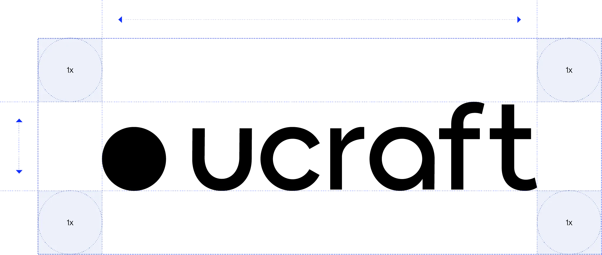
Minimum print size 0.6 inch (15 mm) wide. Minimum digital size 72 pixels wide.
Smallest size use
The minimum size the primary logotype may be used for print applications is (15mm) wide.
Logotype artwork
Do not attempt to redraw or recreate any element of the logotype. Use the approved digital files of the artwork.
Clearspace
The minimum clear space around the logotype is equivalent to the width of the U from the logotype.
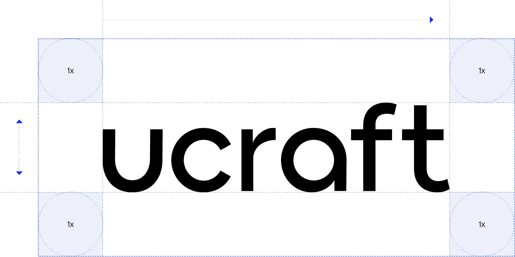
Wordmark
03.1

We prefer to use our Full logo. However, some use cases will steer you towards the sole use of the wordmark. For example, this may happen when the icon is used elsewhere in the layout.
*Ucraft logo is a unique combination of several fonts and is entirely adjusted to our motifs making it the only one of its type.


Icon
Icon
Icon
Icon
Icon
Icon
Icon
Icon
Icon
Icon
Icon
Icon
Icon
Icon
Icon
Icon
Icon
03.2
The ● and the U work together to create the perfect balance of the Ucraft Next ideology. This balance between business and design encompasses two polar opposites and brings them to one.

the warm, dynamic, asymmetric circle joins with the cold, static, geometric and symmetric square to target users from both poles and bring them to one.
Craft
Organic
Warm
Technology
Synthetic
Cool
Balance
Primary Black Icon (Monochromatic)
Primary White Icon (Monochromatic)
Minimum print size 0.4 inch (10 mm) wide. Minimum digital size 72 pixels wide.
We use Icon as a standalone brand element, as well as an integral part of the logo. By doing so, it creates a strong and distinctive brand symbol. The icon is the distinctive sign of the brand rooting from U-craft. The icon should be used as the reduced form of our logo in tight spaces.
As the other integral element of the logotype icon the Dot accompanies “U”. As a symbol, the dot and the wordmark letter U are played along to replace the full logo. “U” should not be used separately or in another form, order, or representation than the given.
Icon usage
03.3
If there is a need to use both the logotype and the icon, it's preferable to use the word mark instead of the full logotype.


Unlimited
"Just dance"
12 months
Subscription
Partnership lockup
04
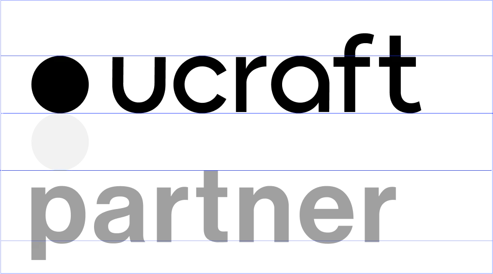
Aligning partnership logos should follow clear space rules. Let the logotype breathe!
We respect the logotype by giving it some space. The minimum clear space that must surround the logotype is equivalent to the distance between the symbol and the wordmark.


Don't change proportions

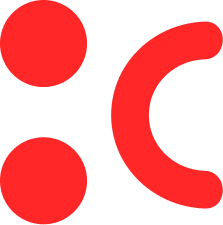
Don't outline the logo


Don't add shadows


Don't recreate our logo


Don't stretch or rotate


Don't colorize our logo

Don't replace icons

Don't outline the icon

Don't change paddings

Don't add shadow

Don't stretch or rotate

Don't change our icon
The Symbol
Layout
05
As a pattern or an additional element, the Dot (as a bigger circle or another shape rooting from it) may be used as an additional element.
In addition, Ucraft Next has specified the elements of our logotype in consideration of internal and external use cases: The U element will be used when talking about Ucraft team members, whereas the Dot - when talking about our users.
Layout construction
05.1

Typography
04
Aa
45 Light
75 Bold
For headings we use Neue Haas Grotesk Display Pro 75 Bold Typeface.
Also, there is one option 45 Light, which we can use as an addition.
0123456789ABCDEFGHIJKLMNOPQRSTUVWXYZabcdefghijklmnopqrstuvwxyz!"#$%&'()*+,-./0123456789:;<=>?@{|}~¡¢£¤¥¦§¨©ª«¬®¯°±²³´¶·¸¹º»¼½¾¿ÀÁÂÃÄÅÆÇÈÉÊËÌÍÎÏÐÑÒÓÔÕÖ×ØÙÚÛÜÝÞßàáâãäåæçèéêëìíîïðñòóôõö÷øùúûüýþ
Color
06
The Ucraft brand primarily consists of black and white colors, which reflect the brand’s simplicity and straightforward, user-friendly approach to website building. Likewise, a brighter shade of green has been chosen as the third primary color for our eCommerce solution since it’s both eye-catching and works harmoniously with our entire color palette.
Regarding secondary colors, we use blue, purple, yellow, and red, which are all associated with specific attributes and features of our builder. This goes without saying, but we ensure that all secondary colors are carefully selected to match their corresponding attributes and features
Monochrome
Primary colors
Green - used to represent our eCommerce solution
HEX: #00F966
HEX: #003214
HEX: #006428
HEX: #00C751
HEX: #80FCB2
Black
HEX: #000000
White
HEX: #00F966
Dark Charcoal
HEX: #313131
HEX: #595959
HEX: #838383
HEX: #ADADAD
HEX: #D6D6D6
HEX: #EAEAEA
Monochrome
Secondary colors
Purple - reflects our Ai platform
HEX: #C58BFF
HEX: #271C33
HEX: #4F3866
HEX: #9E6FCC
HEX: #A987CC
HEX: #9583A6
Blue - reflects our Visual Editor
HEX: #4F58FC
HEX: #181A4C
HEX: #2F3597
HEX: #5960E3
HEX: #CACDFE
HEX: #767899
Yellow - used in association with marketing tools
HEX: #FFD718
HEX: #4D4107
HEX: #CCAC13
HEX: #C0AC4C
HEX: #FFDF46
HEX: #99916B
Red - reflects optimism and high energy
HEX: #F14E1C
HEX: #301006
HEX: #C13E16
HEX: #DA5830
HEX: #F47149
HEX: #F8A78E
Additional colors for digital use only
Secondary colors
HEX: #3E3C30
HEX: #4C5336
HEX: #868167
HEX: #BBAD99
HEX: #234439
HEX: #64A18D
HEX: #A6E96A
HEX: #D9FF63
Merch
07
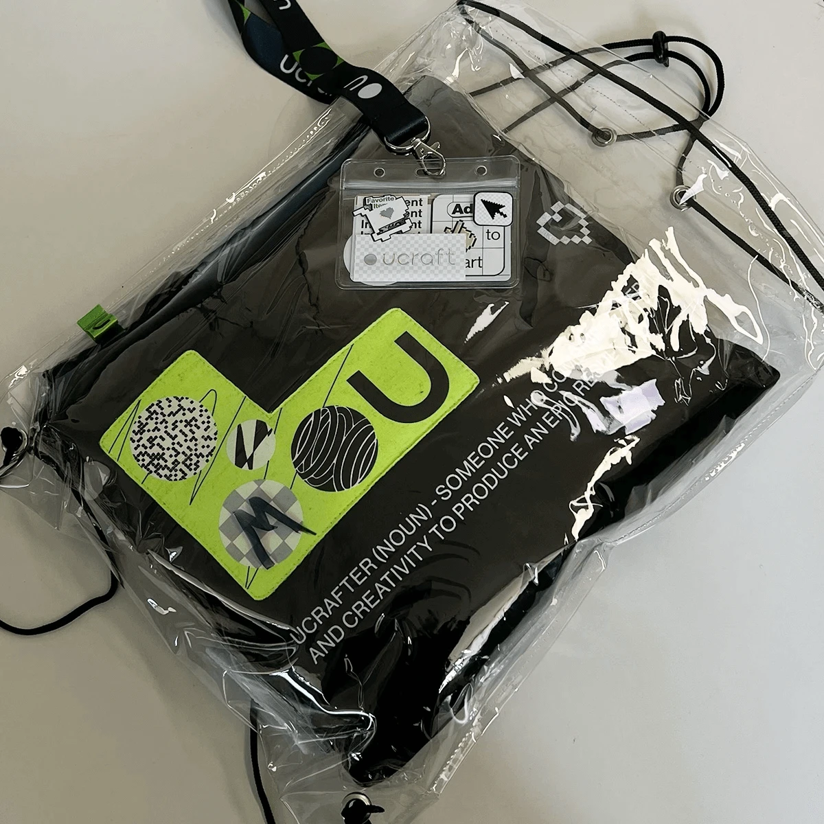
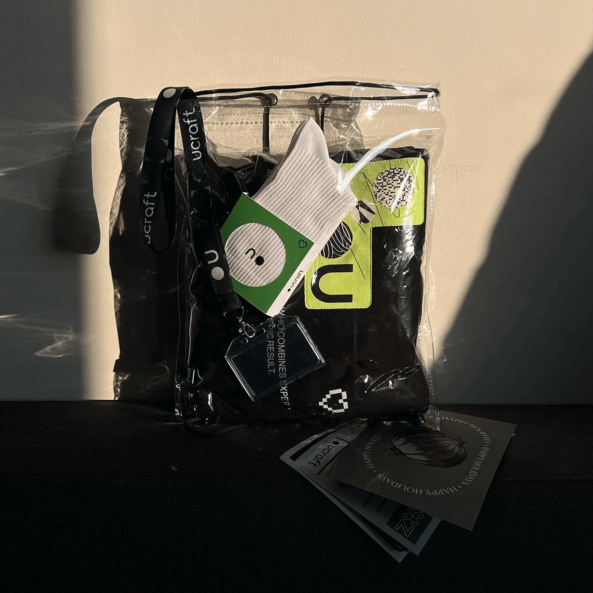
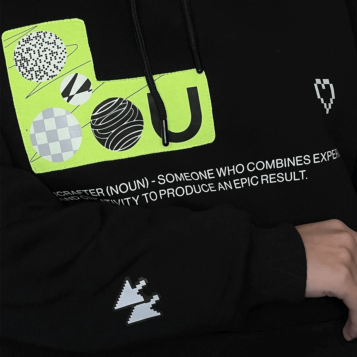
2022 Christmas Pack

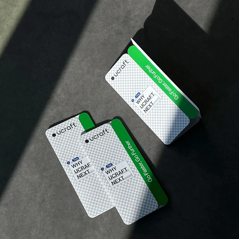
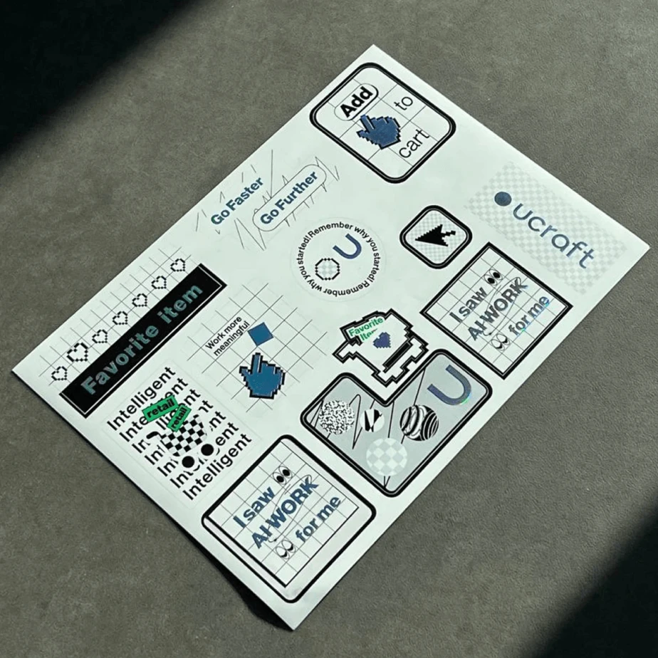
STICKER PACK 2022 STICKER PACK 2022
STICKER PACK 2022 STICKER PACK 2022
© 2024
